Glow-Up
⏳ Project Duration: 12 weeks
🧰 Tools: Figma , AdobeXD , InVision App
🙋♀️ My Role: End-to-end product designer
OVERVIEW
bringing products from store to online to reach more customers
Glow-Up is a cosmetics brand that has been focusing on in-person shopping since they first started 10+ years ago. They now want to bring their products online to more conveniently reach customers.
CHALLENGE
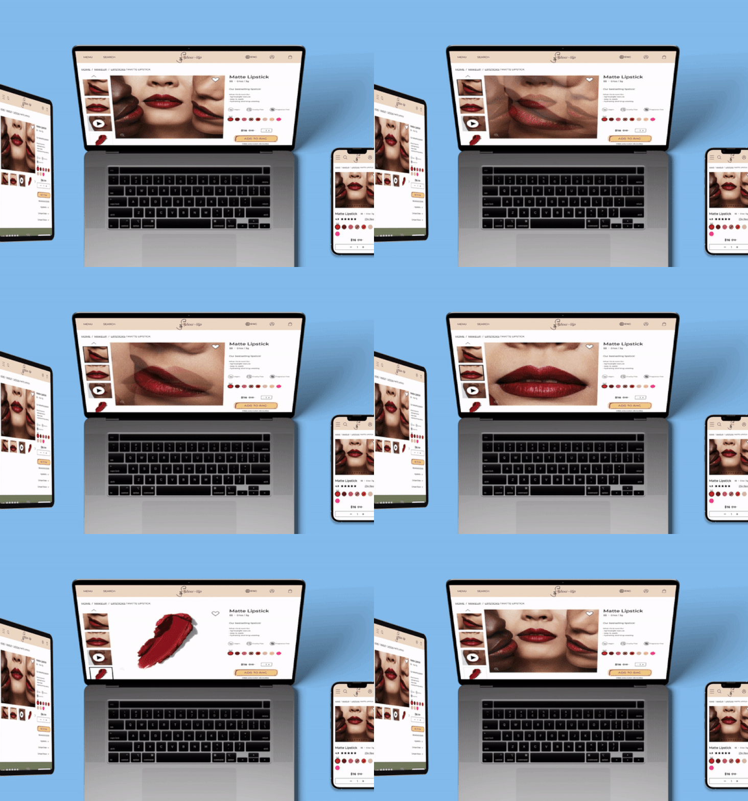
product image may differ from real-world application
How might we create a more seamless transition between online and in-person shopping?
COMPETITIVE ANALYSIS
how do existing successful beauty brands bridge the gap between online and in-store experiences?
RESEARCH & KEY INSIGHTS
users look for informative features that help them confidently make an online purchase
After understanding the market and competitors, I wanted to look deeper into user habits and pain points during purchase journeys, so I spoke with 4 female cosmetics shoppers within the age range of 27 - 56 years old. I drew 4 main insights after analyzing the interview results.
“An easy-to-use website impacts whether the user will buy the product and come back for more.”
— Karen, Interview Participant
Interview insights helped to define our target user, which allowed for a deeper understanding of who our users are and what kind of shopping experience they were looking for.
Meet Diana, a beauty enthusiast working in the fashion industry. Due to her busy schedule, she enjoys the flexibility of online shopping anytime, anywhere, instead of making the time (and trip) to go to a store each time.
INFORMATION ARCHITECTURE & IDEATION
visualizing concepts & structure
Understanding the target audience and user needs, I moved on to create a site map to show a visual of the overall structure of the website. It served as an outline of the screens and actions the user could take within the website. Since the e-commerce website had so many components, without making a site map, it would’ve been difficult to organize everything.

FEATURE GOALS
bridging the gap between product images v.s. real-world application
Important design features that solve the challenge and build brand loyalty are:
High-resolution, diverse try-on images and videos
“Compare Shade” and “Compare Texture” to compare with other products that the user may be more familiar with
Specific filters in the reviews section to quickly find relevant results
Easy shipping and returns
USABILITY TESTING & SOLUTIONS
successful navigation & purchase
Tasks
Search for and filter out specific type and color of lipstick.
Make purchase / check-out.
# of Users
5 (22 - 56 years old)
Test Objectives
Overall flow & navigation
Smooth check-out process.
Features & details are informative enough for user to make purchase online without feeling the need to try product in person.
After gaining insight to the test findings, the key updates were gathered.
More specific filters in the reviews section for users to quickly find what they need.
Include product color chip name along with color chip - for clarity and also as accessibility feature.
Include option to enter promo / gift card code before entering payment method for better flow.
BRANDING & DESIGN SYSTEM
REFLECTION
key takeaways & next steps
It was a challenge to make a well-rounded, smooth checkout process, as there are so many details involved. However, other than doing research in this area, usability testing really helped to understand the user’s thoughts and experiences.
The next steps for Glow-Up would be to continue to perfect the “website v.s. reality” concept. I would work with developers to create an even more seamless transition by integrating high resolution AR and filters for the user to see how they would look with the product or shade. The “compare shades” library to compare with other brands’ shades will also be constantly updated and expanded as new products hit the market.


